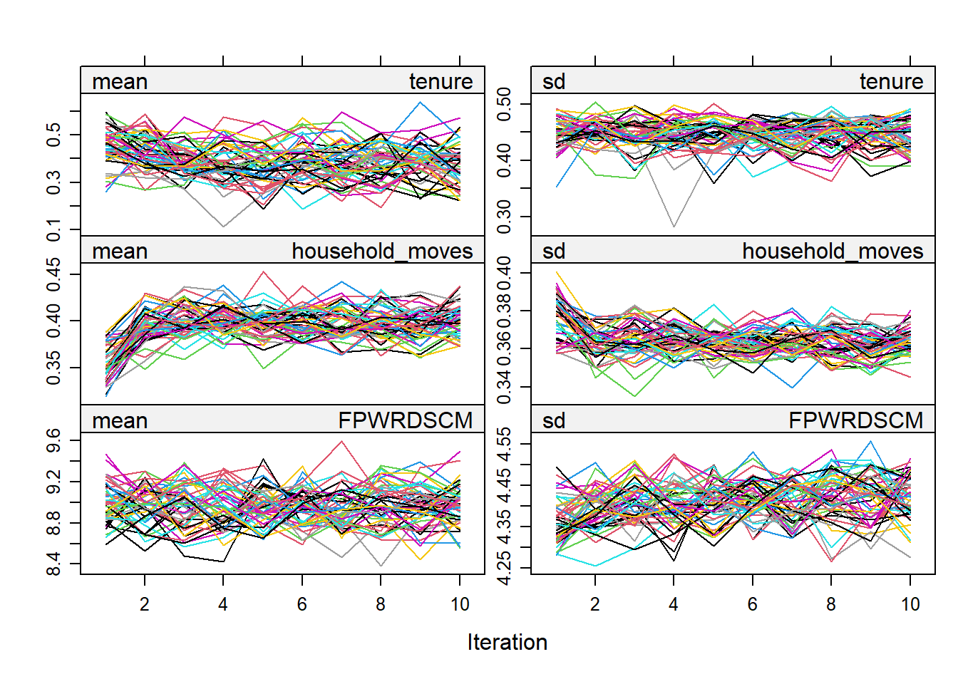
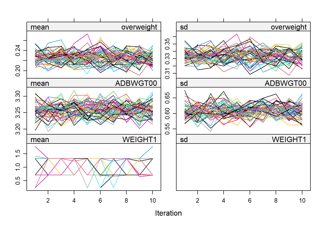
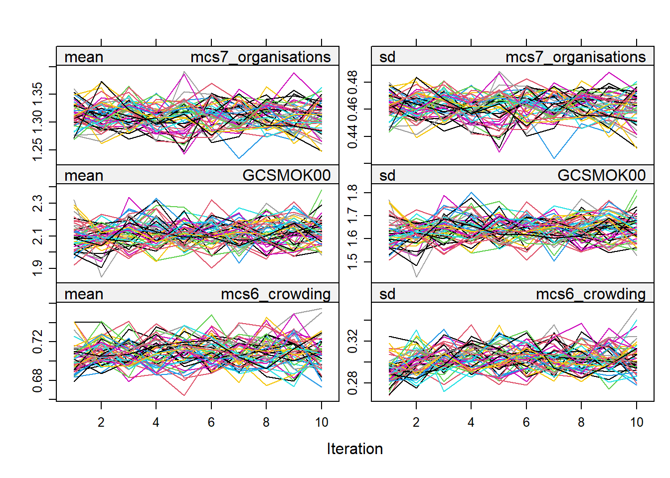
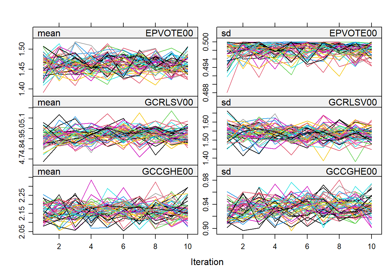
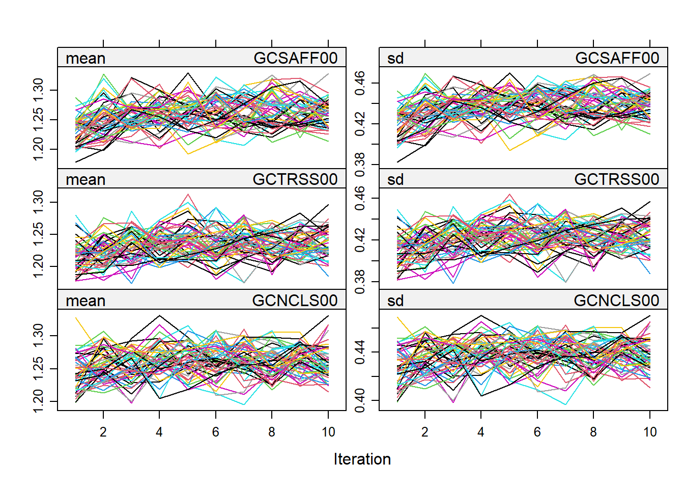
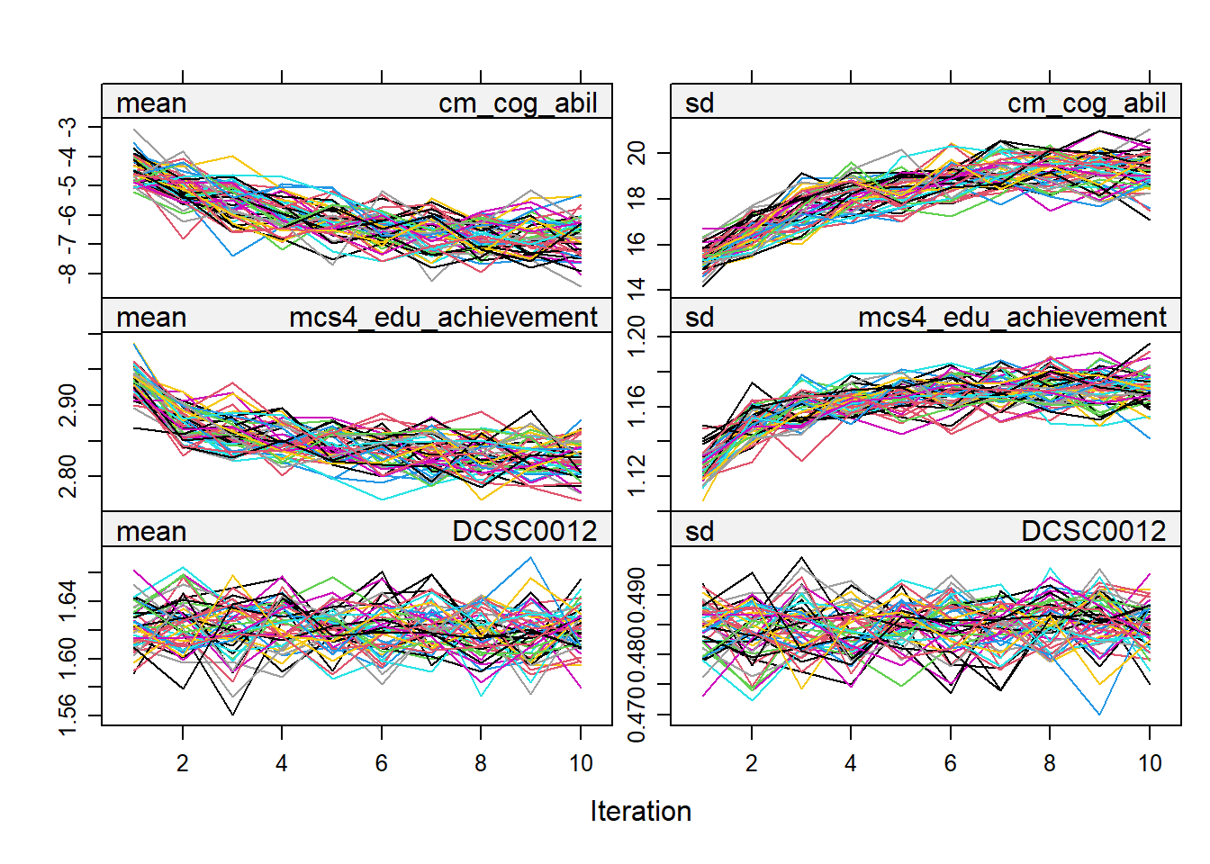
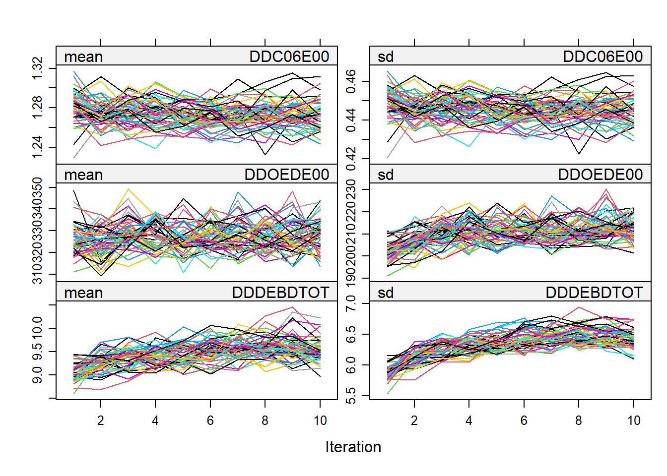
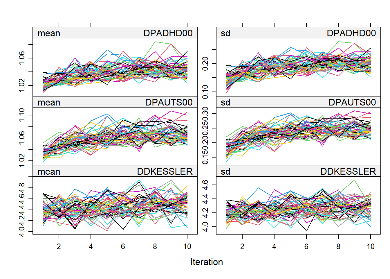
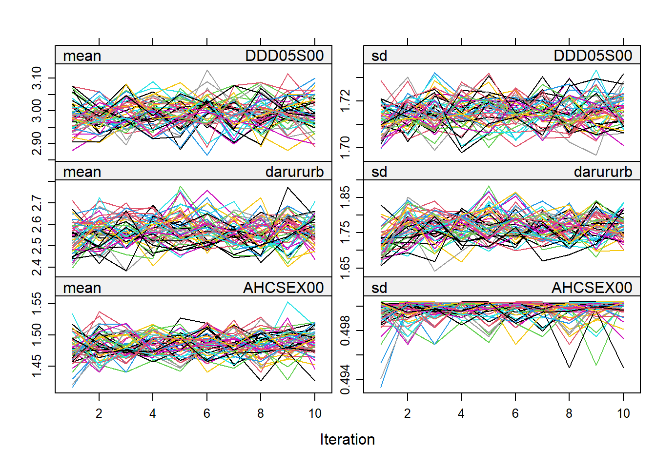
Below are the trace plots from the multiple imputation carried out for the purpose of deriving weights.
plot(imputed_data)
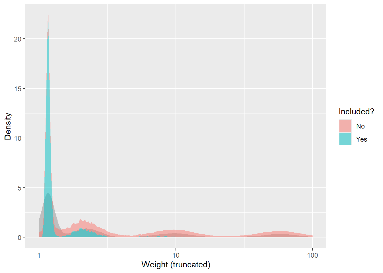
Raw weights distributions
The histograms below show the distributions of raw derived weights. Below that, some extreme percentiles (of participants included in analysis) are printed. The distributions of participants included in the analysis are shown in blue, and those of excluded participants in red.
On the basis of the above distributions we elected to truncate weights at the 98th percentile (i.e. any values above the 98th percentile were reduced to the value at the 98th percentile). This is to avoid certain extreme predictions dominating the results.
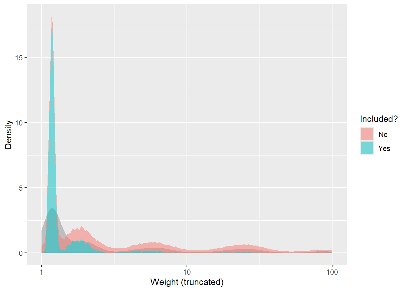
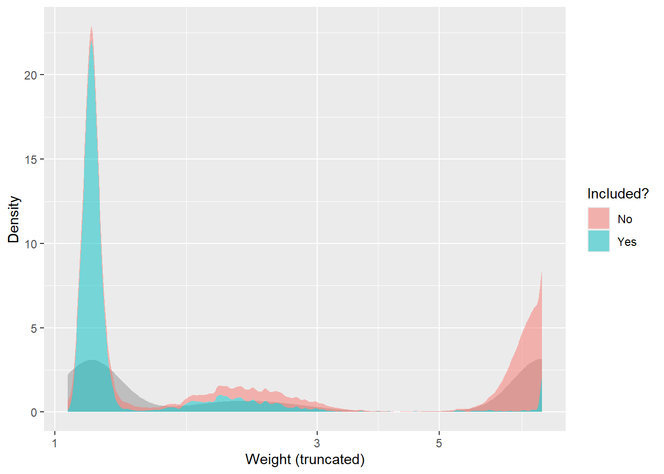
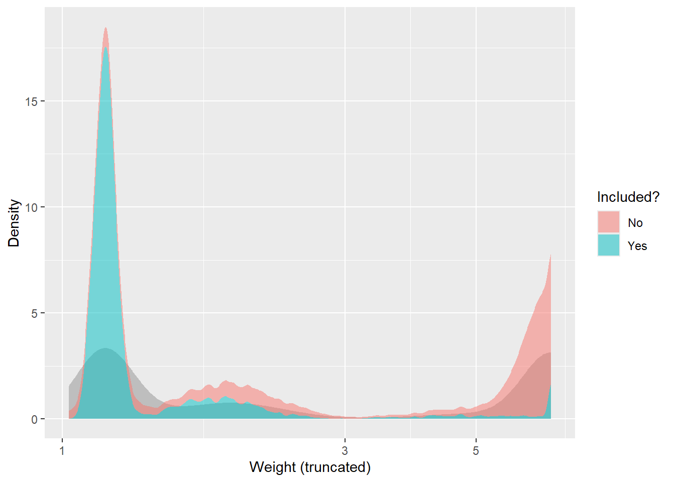
Truncated weights distributions
Below, the distributions of weights as truncated are shown.
Period 1
data_final_1 <-data.frame(weight = weights_final$period1$weights, included = weights_final$period1$included)data_final_1 <- data_final_1 %>%mutate(included =case_match(included, 1~"Yes", 0~"No"))ggplot(data = data_final_1, mapping =aes(x = weight, y =after_stat(density))) +stat_density(fill ="grey") +stat_density(mapping =aes(fill = included), alpha =0.5) +scale_x_log10() +labs(x ="Weight (truncated)", y ="Density", fill ="Included?")
Period 2
data_final_2 <-data.frame(weight = weights_final$period2$weights, included = weights_final$period2$included)data_final_2 <- data_final_2 %>%mutate(included =case_match(included, 1~"Yes", 0~"No"))ggplot(data = data_final_2, mapping =aes(x = weight, y =after_stat(density))) +stat_density(fill ="grey") +stat_density(mapping =aes(fill = included), alpha =0.5) +scale_x_log10() +labs(x ="Weight (truncated)", y ="Density", fill ="Included?")